

How to use SwiftUI Gauge and create custom gauge style in iOS 16
In this tutorial, we'll check out SwiftUI Gauge views, which was introduced in iOS 16. You'll learn how to use Gauge to create a temperature gauge


SwiftUI includes a new view named Gauge for displaying progress in iOS 16. It is used to display values inside a range. Let's look at how to use the Gauge view and deal with different gauge styles in this tutorial.
But first let's take a look at Apple's official definition for the Gauge view.
A gauge is a view that shows a current level of a value in relation to a specified finite capacity, very much like a fuel gauge in an automobile. Gauge displays are configurable; they can show any combination of the gauge’s current value, the range the gauge can display, and a label describing the purpose of the gauge itself.
Simplest Gauge
The simplest way to use the Gauge view is to pass a value to the init method. In it's most basic form, the value of the gauge is in 0.0 to 1.0 range.
// Most basic usage of the Gauge view
struct ContentView: View {
    var body: some View {
        Gauge(value: 0.5) {
            Text("Gauge")
        }
    }
}
 GaugeView in Light Mode
 GaugeView in Dark Mode
Gauge with a range
You can also make the Gauge view display a value as a percentage of a range. The value must be between the range's minimum and maximum values. The Gauge view will display the value as a percentage of the range.
// Gauge view displaying a value as a percentage of a range
struct ContentView: View {
    var body: some View {
        Gauge(value: 25, in: 0...100) {
            Text("25% Gauge")
        }
    }
}
 25% GaugeView in Light Mode
 25% GaugeView in Dark Mode
Gauge styles
You can customize the Gauge view by passing a GaugeStyle to the gaugeStyle modifier. The GaugeStyle protocol defines the appearance of the Gauge view. There are two default styles provided by SwiftUI: LinearGaugeStyle and RadialGaugeStyle.
The available gaugeStyles are:
.accessoryCircularCapacity.accessoryCircular.accessoryLinearCapacity.accessoryLinear.linearCapacity.automatic// Gauge view displaying a value as a percentage of a range struct ContentView: View { var body: some View { Gauge(value: 25, in: 0...100) { Text("Label") } .gaugeStyle(.accessoryLinearCapacity) } } Different GaugeView styles in Light Mode
 Different GaugeView styles in Dark Mode
Custom Gauge style
You can also create your own custom gauge style by conforming to the GaugeStyle protocol. The GaugeStyle protocol defines the appearance of the Gauge view.
// Custom GaugeStyle
struct CustomGaugeStyle: GaugeStyle {
    func makeBody(configuration: GaugeStyleConfiguration) -> some View {
        ZStack {
            Circle()
                .stroke(Color.gray, lineWidth: 10)
                .frame(width: 100, height: 100)
            Circle()
                .trim(from: 0, to: CGFloat(configuration.value))
                .stroke(Color.blue, lineWidth: 10)
                .frame(width: 100, height: 100)
                .rotationEffect(Angle(degrees: -90))
            Text("\(Int(configuration.value * 100))%")
                .font(.title)
        }
    }
}
// Custom GaugeStyle usage
struct ContentView: View {
    var body: some View {
        Gauge(value: 0.5) {
            Text("Gauge")
        }
        .gaugeStyle(CustomGaugeStyle())
    }
}
 Custom styles in Light Mode
 Custom styles in Dark Mode
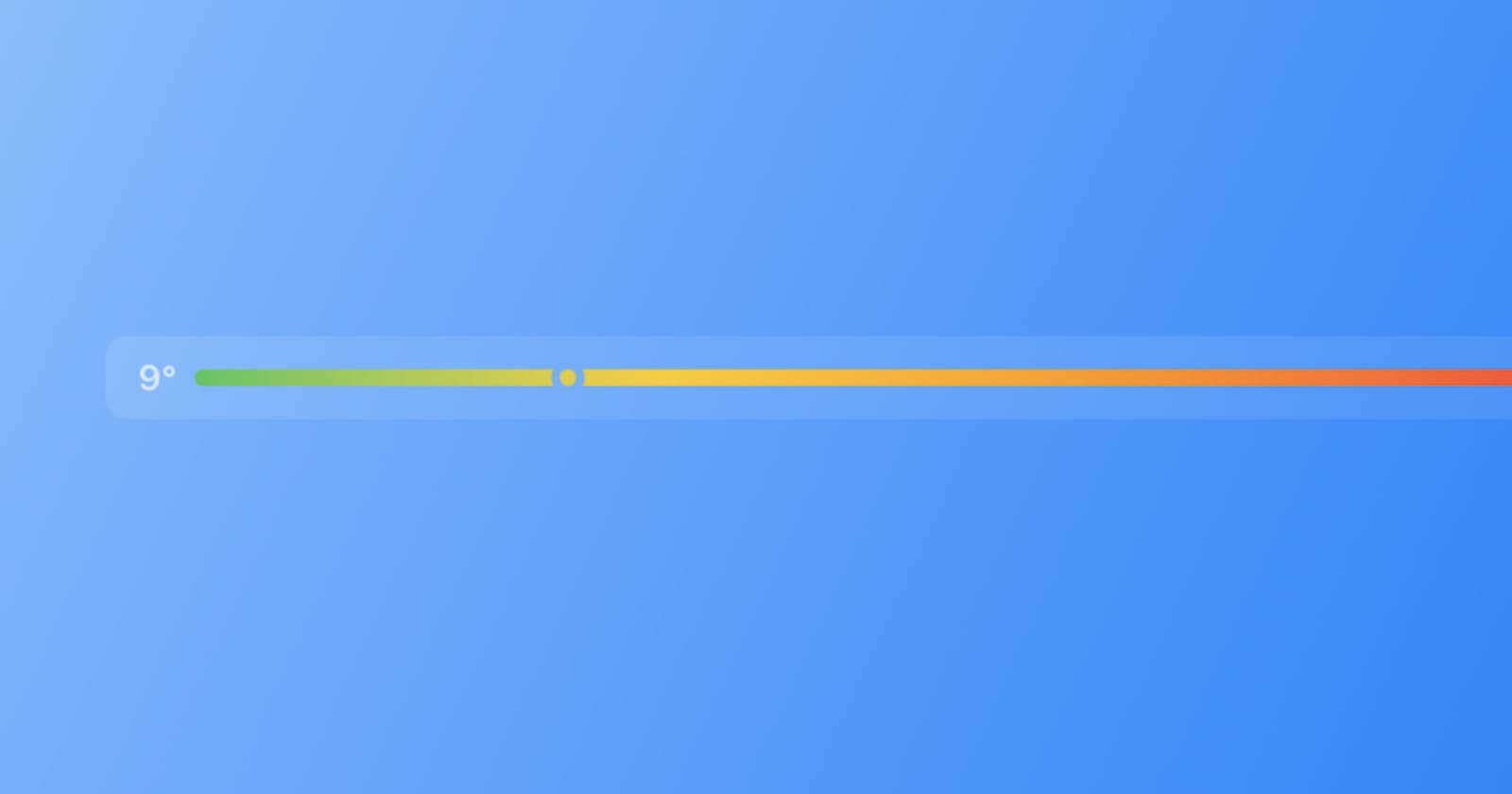
Our Temperature Gauge
And finally let's make a nice looking temperature gauge. We will use the accessoryLinear gauge style and a nice gradient tint modifier.
struct TemperatureGaugeView: View {
    private var min: Double = 7.0
    private var max: Double = 22.6
    private var current: Double = 12.6
    var body: some View {
        Gauge(value: current, in: min...max) {
            Text("Tinted Gauge")
        }
        currentValueLabel: {
            Text("\(Int(current))°")
        }
        minimumValueLabel: {
            Text("\(Int(min))°")
        } maximumValueLabel: {
            Text("\(Int(max))°")
        }
            .tint(Gradient(colors: [.green, .yellow, .orange, .red]))
            .gaugeStyle(.accessoryLinear)
    }
}
 Temperature Gauge Light Mode
 Temperature Gauge Dark Mode
Conclusion
I hope this tutorial helped you understand how to use the Gauge view in SwiftUI. If you have any questions, please send me a little message, I will be happy to help you. If you liked this tutorial, please share it with your friends. Thank you for reading!